Introduction
Designing an effective dashboard layout is crucial for enhancing data visibility and supporting decision-making processes. A well-designed dashboard not only conveys the necessary information but does so in a way that is easy to understand and focuses on the message and insight, not graphical fireworks.
Principles of Effective Dashboard Design
To ensure clarity and effectiveness, consider these foundational principles when designing your dashboard layout:
- Strategic Layout: Arrange widgets in a manner that reflects their importance. Position the most critical data points in the most prominent spots, such as the top left corner, where viewers typically start scanning.
- Section Divisions: Use sections to organize related data visually. This can help users quickly locate the information they need without feeling overwhelmed.
- Consistency in Design: Data Responder ensures a uniform appearance through consistent color schemes and a structured grid layout, enhancing the dashboard’s readability and professional appearance.
Utilizing Data Responder’s Flexibility
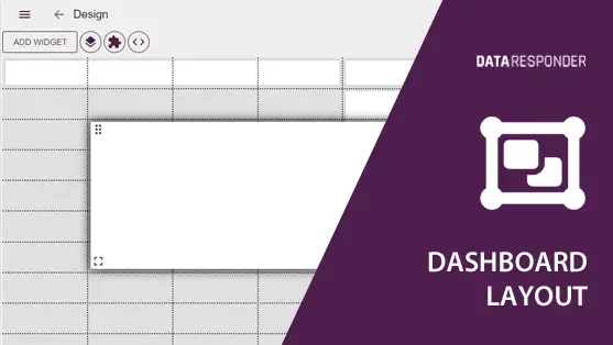
Data Responder allows for custom configurations of widget sizes and placements, offering:
- Adjustable Widget Dimensions: Tailor the size of each widget to suit the importance and complexity of the information it displays.
- Grid System: A grid layout helps in maintaining an organized look, making the dashboard aesthetically pleasing and easier to navigate.
- Unified Color Schemes: Choose from predefined color schemes that provide coherence and enhance data comprehension.
Composition Techniques
Effective composition is key to enhancing the usability and aesthetics of your dashboard; here are some techniques to help you achieve that:
- Symmetry and Balance: Use symmetrical or balanced designs to create visually appealing and easy-to-understand dashboards.
- Visual Hierarchy: Use design elements like size and placement to establish a visual hierarchy that guides the viewer’s eye to the most important information first.
- Golden Ratio: Consider implementing the golden ratio for a naturally appealing layout, which can guide the placement and sizing of dashboard elements.
The Golden Ratio, approximately equal to 1.618, is a mathematical ratio often found in nature and art, considered aesthetically pleasing to the human eye. It has been used in design and architecture for centuries to create visually balanced and harmonious compositions. When applied to dashboard layout design, the Golden Ratio can guide the placement and sizing of elements to create a naturally appealing and effectively organized display, enhancing the user’s ability to interact with and understand the information presented.
Best Practices for Managerial Dashboards
Designing dashboards for managerial use involves:
- Focus on Communication: Dashboards should facilitate easy communication of complex data. They should be designed with the goal of making information clear and actionable for decision-makers.
- Audience Consideration: When designing dashboards, imagine who will use them and their competencies. Consider what information they can absorb, how much time they have to engage with the data, and from what distance they will view the dashboard.
- Iterative Design: Continuously refine the dashboard based on feedback from its users to ensure it remains effective and relevant.
Conclusion
The design of a dashboard is as crucial as the data it represents. With Data Responder’s flexible design capabilities, organizations can create tailored dashboards that not only meet their specific needs but also adhere to best practices in data presentation and user interface design.

